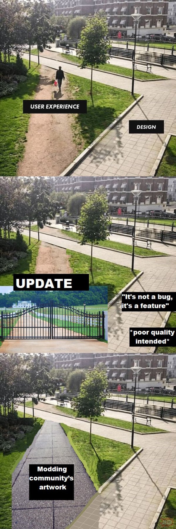
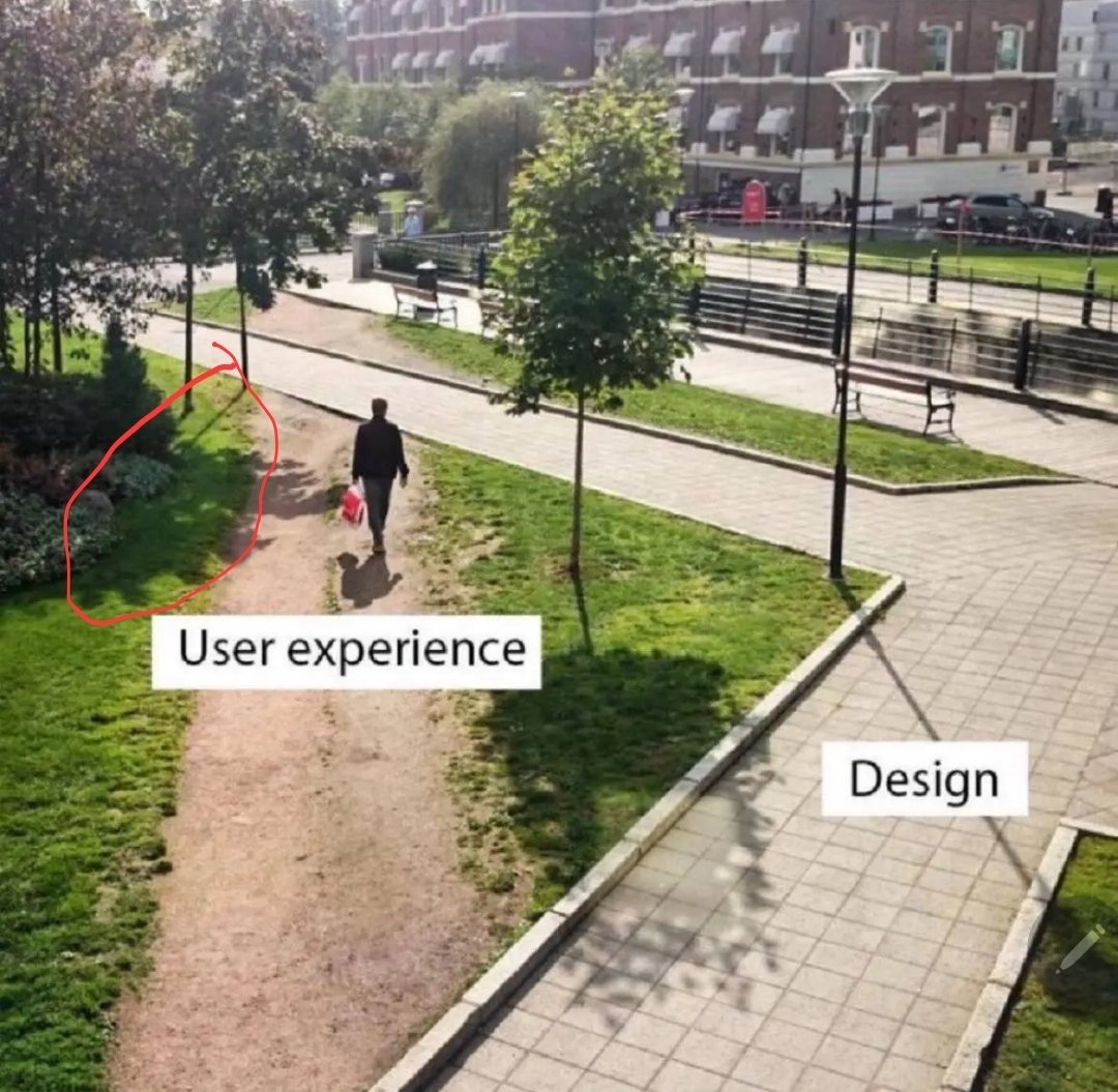
Pretty sure the user experience folk are screaming for a path to be built there but are getting ignored.
They aren’t being ignored. The corner needs to be a right angle for compliance reasons.
But the actual corner isn’t even a right angled corner.
They were forced to cut corners in implementation.
Everyone says, they are not bringing their best angles. Triangles. Quadrangles. And some I assume are acute angles.
All I want is an angle who’s acute and not right.
What we should do is put chainlink fence around the corner, but make the part that the users loved the most accessible with a monthly pass that they can only walk on with shoes purchased at the university store.
- spez
You mod 16 subs, what do you get?
Another day blocking API requests.
Saint Peter don’t DM me cuz I can’t go.
I owe my soul to Spez’s asshole.
It’s important we do it that way for our 🌟brand identity🌟.
How about a pond?
Management wants us to add more AI and Machine Learning so the user ends up in the parking lot.
A lot of universities with large campus grounds take the approach of observing the natural foot traffic wear patterns on grassy areas, and then build walkways where the most worn down parts are.
Its… pretty obvious.
If everyone is taking an alternate, non designed path… your design sucks, modify it to facilitate what people find more effective.
These are apparently called “Desire Paths”
And there’s a whole community for them! Not sure how to link to it though.
Just give the URL, I’ll do a federated link for you.
Literally just put it in that way, for future notice - there’s no hidden formatting here.
Same for users — just change the ! to an @.
Example: @pageflight@lemmy.world
At least on the official web app, that doesn’t render as a link. You’ve got to do it as [whatever](u/pageflight@lemmy.world)
iirc it’s what they did in central park. Don’t create paths and later pave the desire paths that show up
deleted by creator
Don’t underestimate youthful rebellion!
It is not design issue but not well behaved people. It is like saying that the trash can isn’t a good design because people are throwing trash on the street. You don’t path like that in countries with people that respect rules.
People throwing thrash on the way usually is a sign of not enough trash cans in an area.
Yes of course there are always a few assholes who just waste, but in general you can go by that rule.
People throwing thrash on the way usually is a sign of not enough trash cans in an area.
No. I regularly see trash on the ground with sometimes as much as 5 trash cans in sight that are less than 20m away.
I believe you, however statistics say that overall people tend to use trash cans if available.
This means your neighbours is special and a lot of assholes are there.
Might that trash have blown out of the can or maybe an animal took it out?
It is not an excuse, you can always bring your trash with you. That is what Japanese people do as there no trash bins in Japan (they are really real rare).
I do take my trash with me but less functional design is a bad design.
Who is protected by rules that keep you on the path? Who am I impressing by taking the ten seconds out of my day to stay on the pavement?
I don’t have much respect for grass. Take the shortcut and relish the rare opportunity to be near nature in the city
Where do you see frequent trash cans and people regularly throwing trash out in the street?
Typically trash in the street means you don’t have enough trash cans, or a bunch of youth or homeless people whom society is failing.
I have been in few countries in Europe and I see trash in the street. Japan doesn’t have trash bins (not in the street, train, stations) and you won’t see trash in the street.
Yeah but there’s other contributing factors, such as the highly traditional society and a greater sense of honour and conformity
You are lying or not paying attention. Got to Tokyo and you’ll have plenty (as per Japanese standard) of trash in the streets specially near Shinjuku and Shibuya
And yes they mostly take their trash with them as there are no trash bins. But is it a smart design though?
I am not lying and if you do some search you will find out that there are rarely trash bins in the whole Japan. And that is the result of the 90s terrorist attacks. I have been there and I rarely seen trash bins and I have been in many different cities. There are may be exceptions in some areas but that is not the norm.
Why isn’t a smart design? Why spend money for something that is not necessary. Also bringing trash home will ensure that people will recycle them. Trash recycling do exists in Europe but not in street trash bins. Trash bins exists in Europe because otherwise people will just throw their trash in the street like they do for cigarettes butts.
I don’t need research because I’ve been to Tokyo plenty of times and I saw in fact lots of trash in the ground.
And again you’re wrong, trash bins for recycling do exist in Europe because I use them all the time, and I also happen to have visited lots of European countries and I didn’t see that much more trash in the ground than Japan. It’s true for cigar butts (its mind boggling in the Mediterranean countries) , but not trash. You probably had one “bad” experience and are using that evidence anecdotally. You are comparing Japan, a country, to Europe, a continent, it’s not fair
Haha, I need to take your word for because you say so when everyone says that trash bins are rare in Japan. There are even people asking for a guide to find trash bins.
Trash bin do exists but not everywhere especially in the streets. And when they exist it is only two types. And you will that people do not recycle and I saw the cleaners mix them.
When I say there is trash in the ground, I didn’t mean that you see it everywhere.
Why isn’t it fair to compare Japan to Europe?
No,
Whenever that happens, the design is wrong.
Fixed. Added a wall with razor wire on top to prevent this.
Ah yes, the hostile architecture approach.
In IT, sometimes there’s security reasons for the designed detour.
But then good design would completely obstruct the shortcut from the user’s view.
change log: We’ve adjusted the 20 year old UI to better reflect modern aesthetic trends that our new hires learned in school.
Works as intended. kthxbye
I think it’s from the time where things were done manually and round lines were a pain to draw. There wasn’t AutoCAD and undo features in a neat software 🤣

Should include a concept to reduce impervious surfaces in modern times. User experience is not the only variable.
Designers need to wake up and realize their job is to understand what the user wants not what they saw in a wet dream.
Not a universal rule, however. Theres the whole concept of “optimizing yourself out of the fun” and what not in video games. Or the hardships being part of what makes a game fulfilling. It depends on what your goal is
Wake up Nee-Oh!
I, unfortunately, have to use GitHub at $DAYJOB and this is me. I navigate most of the webpage via the URL bar now.
Basically, let’s say I’m working on a repo
github.com/tomato/sauce/and want to navigate to the Releases page.Via the webpage:
- Type
github.cominto the URL bar. - Don’t find
tomato/sauce/in the list of recent repos, even though it’s the only repo I work on. - Click on some other repo that’s at least in the
tomato/org. - Navigate up to the
tomato/org. - Find the
sauce/repo in the list. - Traverse half the fucking screen to hit the “Releases” heading in the middle of the About-section.
Via the Firefox URL bar:
- Type
gi→t→s→r→. - Hit Enter.
I admit, it’s hard to compete with the latter, but I wouldn’t know how to navigate that way, if the former wasn’t so terrible.
What kind of sicko try to find their repos from the recent list on the main page??
Hopefully somebody else $DAYJOBs at GitHub and will see this.
This is me, but with my work’s Azure DevOps. Nice to meet a fellow auto-complete bro.
- Type
“What the user needed” / “What management demanded”
This is called a “desire path.” https://en.m.wikipedia.org/wiki/Desire_path
What the shit happened to that tree’s shadow?
Probably the tree is shadowing the same area that a window in or near the building the picture is being taken from is illuminating.
Also, why is this shadow off from the others

that’s just perspective, they’re only parallel when looking for a perfectly top-down angle

deleted by creator
The tree on the right has that block missing in its shadow, the trees on the left are casting their shadows in a slightly different direction, and they guy on the dirt path’s shadow seems too dark and clear. Once you pointed out something was wrong, it’s hard not to see other mistakes.
We are so paranoid about Photoshop and lately AI that we start seeing mistakes where there are none. All these things are perfectly normal.
The sun is fairly low in the sky, just a bit to the right of the guy on the dirt path, whose shadow is almost but not quite straight vertical.
The guy casts a darker and more crisp, or less diffuse shadow because he is less translucent, or more opaque, than tree leaves, and because the total distance from the heighest tree leaves to the ground is greater than the total distance from his head to the ground.
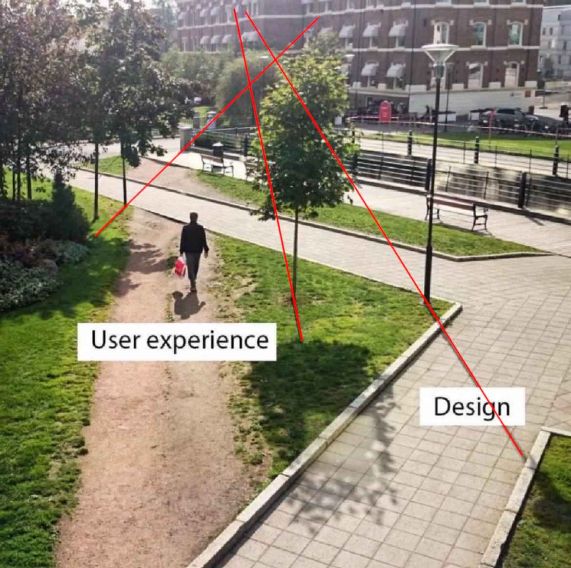
The lines of the tree trunk and lamppost shadows all converge toward where the sun is, if extended toward it.
The illuminated square in the one tree’s shadow is likely a reflection from a window or some kind of metal fixture from a building or object behind the pov of the camera.
The lines of the tree trunk and lamppost shadows all converge toward where the sun is, if extended toward it.

I’m pretty sure that’s not true
Edit: I’ll concede the other points though
Could be a watermark that got removed.
That’s right, it goes in the square hole.
That’s ancient.
Uhh, so looking carefully at the picture, it appears they shouldn’t have bothered with the inner pathway at all, and should have just connected the bridge over the canal (?) in the background to whatever is under the camera.
Not only does the current design fail to provide a short path in demand, it leaves a goofy little boulevard behind the benches in what appears to be a dense, desirable urban area where you shouldn’t waste space.
Needs more plants.
This is an opportunity with creative landscaping.


